As a fully integrated, conversion-centric agency, we know the value of ensuring brand websites are well-optimised for conversions, and how this impacts the full marketing and advertising funnel.
For parents looking for childcare options, this becomes especially important as they’ll be looking for;
- The essential information they need to know in easily findable places,
- Recommendations from authoritative bodies,
- Location, book a viewing or sign-up details.
Why do user experiences matter for conversions?
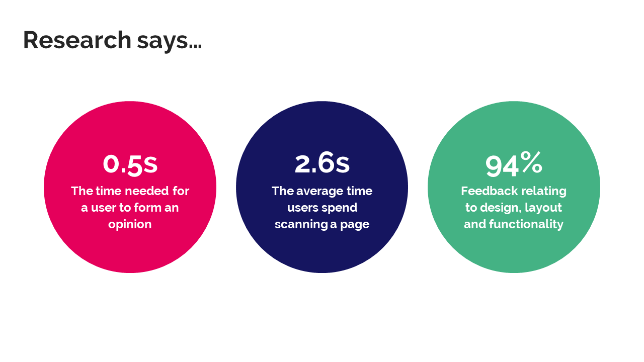
Research shows that 0.5 seconds is all a user needs to form an opinion of your site. In other words, if you don’t win over your visitors within half a second it might already be too late to engage them and win their business.
Users also only spend 2.6s scanning a page so, if you survive past that first half a second, you need to provide compelling content and calls to action in an easily digestible way – and fast.

These two stats come together to form one very powerful point that should underpin every conversion-centric digital strategy – first impressions are essential for driving business.
The benefit of this is that getting insight into user preferences is almost just as fast, enabling us to get high-quality, real-life opinions and feedback from any target audience. And, with 95% of this feedback relating to design, layout, and functionality, it provides clear pathways for improvements.
So, how do top childcare websites measure up to these standards?
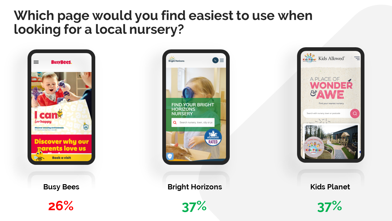
We asked a female audience, aged 25-34, with a household income of £30,000 and above whether they found the Busy Bees, Bright Horizons, or Kids Planet website most useful when looking for a local nursery.

Despite a network of 379 nurseries across the UK and Ireland, Busy Bees were found to have the least useful homepage when looking for a local nursery, with only 26% of respondents finding it most useful compared to 37% for both Bright Horizons and Kids Planet. We think that this is down to;
- An emphasis on colour and appearance as opposed to functionality,
- A heavy focus on being ‘child friendly’ as opposed to being a website for parents,
- The absence of a quick ‘find your local nursery’ search option, as with Bright Horizons and Kids Planet.
We felt that, though Busy Bees’ branding within their homepage was bolder and could be the most effective and engaging, they have used it in a more ‘child-friendly’ way. Though this is a service centered round children, it’s important to recognise that your site is being designed for parents.
This is essential for all brands to recognise and ask the question.... Are you adapting your branding and messaging for each of your user touch points?
Next steps for CRO on childcare
When working to improve conversion rates and user experience on any site, we look to mobile first. Mobile equates to 78% of all sessions and provides the biggest opportunity - a responsive strategy will always be key for any website but, a mobile first approach when optimising experiences will allow for much higher impact.
For Busy Bees, we created mock-ups with some specific changes in mind;
- Creating easier ways to find out if there is a nursery nearby,
- Including official ratings to improve trust,
- Amending the use of branding to appeal more to parents, rather than children.
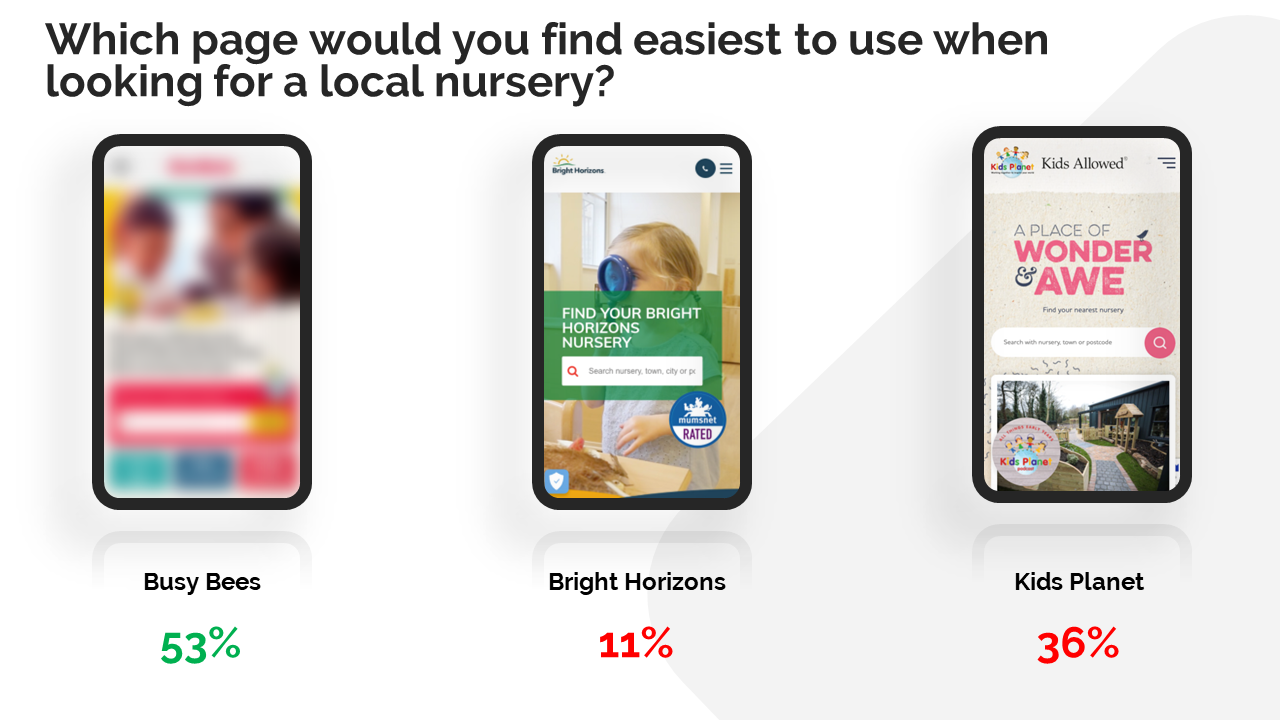
When we resubmitted our final mock-up against the original rival pages, 53% of users would choose Busy Bees over Bright Horizons and Kids Planet.

Using Data-led Design to achieve incremental improvements
Our approach is straight forward. We start by optimising from the beginning (ie. home or landing pages), funnel more and more users through to decision-making pages… then strike at these conversion points, for optimal impact! Ensuring we focus on the primary conversion funnel is pivotal to success.

It’s essential to note that what we looked at above is only the beginning. Applying ongoing tests, refining until we stop getting valuable insight from users is the most effective path to achieving significant growth.
The Secrets to Accelerating Conversion Performance – JourneyCraft & Data-Led Design
We've been improving conversion rates of brands since 2005 – we're experts. We wrote the book on Data-led Design (no, really – we did!) and have dubbed it ‘CRO on steroids’. To be fully optimised we believe every digital strategy must have a conversion centric approach and be forming this from real-life user data. Without this, your conversions are not being optimised and your CPA/ROIS will always under perform.
Brands that rely on paid media channels to drive leads or sales will always be at the mercy of every increasing cost per click – so a continuous strategy of conversion improvement is needed to simply maintain your ROI, let alone improve it.
For example this brand below were working with a £30,000 budget for Paid Search:

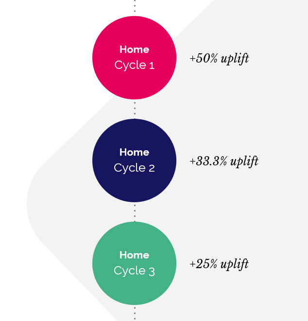
After reallocating just 10% of their PPC budget to conversion rate optimisation, this brand saw a significant uplift in conversions, equating to a 50% increase in ROAS.

After 18 years as a specialist agency in CRO, we’ve also launched our own tool, JourneyCraft. JourneyCraft enables brands to visualise real-life user journeys and filter traffic down to show conversion performance across all marketing channels. Book in a conversation with us to learn more about JourneyCraft, ahead of our general release!
GET THE FULL Q2 2022 REPORT
Learn more about what we can do for your brand, and how we can apply our data-led, fully integrated approach to your digital strategy.
To get a copy of our full report on UK childcare providers, please complete the enquiry form. If you want to talk to us about accelerating your digital performance using data-led design, please call us on 01543 410014 or schedule a call with Phil Robinson.
Photo by BBC Creative on Unsplash


Let's be social
Join our growing social communities to learn more about the benefits of digital marketing and the people who make us tick.