How to track digital performance with thank you pages
What are thank you pages, and why are they important for monitoring performance? Find out more about thank you page best practices.
Read moreLisa Coghlan says we shouldn’t write to be read. Nowadays, readers scan copy instead. Here, she shows how you can write sparkling content that’s tailor-made for a busy online audience.
People read content very differently online than they do offline. Web users are busy, and want to access the information they require quickly. A study has found that 79% of users scan a web page instead of reading every word1. So, if your website content or page design hinders a user’s ability to find the information they require, they will go elsewhere to find it.
Read on to discover how web users read online, and how you can use this knowledge to your advantage.
Most people, when navigating a website, will scan the copy on the page. As a website content writer, it’s important you remember to write as concisely as possible.
If a user feels they have to wade through pages of copy before they reach that one piece of information they require, they’ll leave the page and most likely find a competitor whose web content is clearer. Web users are pretty ruthless, and if the information they require does not jump out at them quickly, you may have just lost out on a sales lead.
Eye tracking research has given us vital information on where a user’s eye is first drawn to on a page. Most commonly, web users will briefly gaze over the entire screen, and land on what first attracts their attention. These user hotspots are generally headlines, subheadings, menus, and the logo.
The upper left corner of the screen usually gets the most attention from the user, whereas the bottom right hand side of the page is often neglected. Eye tracking software identifies that web users read a page in an F shape, landing on headlines, and consistently prioritising the left hand side of the page.
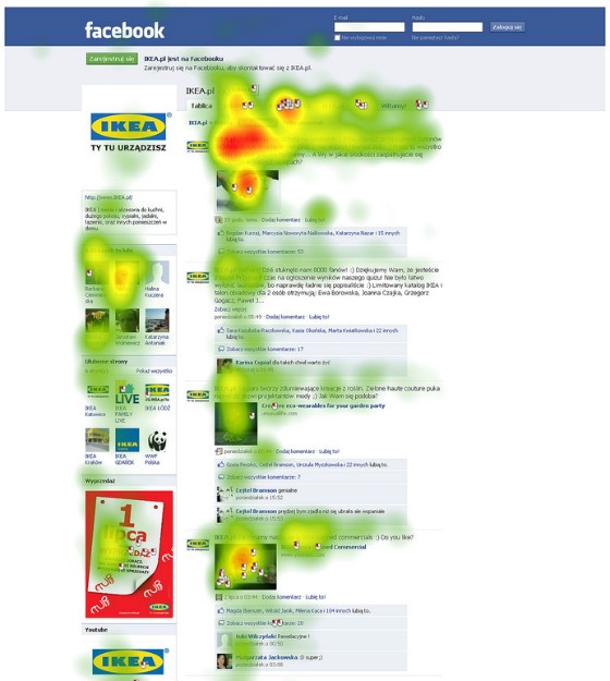 Source: K2_UX at Flickr.
Research has shown that users will initially read horizontally across the top of the page, followed by a second horizontal movement slightly lower down the page. This is then followed by a vertical movement as the user scans down the page
The research dictates that the most important message of the web page should sit in the top left, so that the user quickly identifies it.
Considering eye tracking research is invaluable for a web content writer, as well as a web designer. If the two work in unison to create copy and design that reflects the way a user will scan the page, conversions could potentially increase dramatically.
Now you know how a user reads online, use the following web writing tips to ensure that your web copy is accessible and easily digestible.
Once you’ve used the above techniques to write web content, you should consider if it’s working for you. Using heat map technology on your web site will give you a significant advantage over your competitors. This will allow you to track user hotspots on transactional pages, and what their eye is drawn to on the page.
If you can identify that a banner on your site with vital information on is being ignored by users, you can rearrange your page design and move calls to action, to ensure that the information you present to the user is converting your visitors effectively. It’s important to reassess content regularly to see if your decisions are working for you.
More articles you might be interested in:

What are thank you pages, and why are they important for monitoring performance? Find out more about thank you page best practices.
Read more
Google sets new standards for links and content, new functionality emerges in Analytics and Search Console, and new tool Neurons hits the world of...
Read more
Welcome to the latest round-up of all things digital. This is where we look at the latest updates in the world of PPC, SEO, Content and International...
Read more
Creating conversion-optimised PPC campaigns start at strategy planning. Do you know how you can maximise the return on your ad investment? Dave...
Read more
Wondering how to apply conversion-centric marketing to your advertising strategies? Dr. Dave Chaffey explores why this is essential for growing...
Read more
Episode Six of The Assorted Digital Ramblings Podcast is now live! Learn about Conversion Rate Optimisation with guest Al.
Read more
Are you using Data-led-Design to grow your brand? Dr. Dave Chaffey delves into what techniques you should be using to turn user data into intelligent...
Read more
Heard the term CRO thrown about and not sure what it means? Cameron Hadley takes us through some commonly asked questions on conversion rate...
Read more