The Perfect Persona - Are Your Personas Fit For Purpose?
Dr Dave Chaffey talks customer personas. How effective are yours? Find out more about what Dave recommends.
Read moreDriving a lot of traffic to your website, but struggling to convert your traffic to leads?

Inbound Marketing is no longer a 'new' term within the marketing industry, and many businesses of all sizes have now identified the need to move their marketing efforts to the digitalsphere. But surprisingly, in the 2017 State of Inbound report, marketers are still delivering less quality leads to their sales teams.
Over my years working within inbound marketing, I've come across many CEOs/CMOs who still believe that marketing is 'fluffy', and social media is 'just something your teenage daughter plays on'. With this opinion, it means their marketing team's value diminishes, and focus tends to shift from attracting and converting quality leads, to tracking only the very top of the marketing funnel.
In this blog, I'm going to explain how creating a killer inbound conversion path will make sure you can get the most out of your website by capturing leads at every opportunity in the buyer journey.

Capturing leads from an inbound perspective requires a well thought out strategy, which is focused on a high-quality offer.
According to a study from HubSpot, 47% of B2B buyers view 3-5 pieces of content before engaging with a sales rep. Content continues to be king when it comes to turning prospects who are in the earlier stages of the buyer journey, into warm leads.
Take a look at your buyer personas' common pain points. How could you answer these with educational, non-salesy content?
Creating content doesn't have to be difficult, and there's probably a strong chance you already have product data sheets, case studies, and other collateral that you can easy transform into a webinar, eBook or whitepaper...
Need an example? Why not browse our eBooks and whitepapers...
So you've got the content on your website, but how do you go about attracting downloads?
The first step in capturing a lead on your website is a well worded and eye-catching call-to-action. Your CTA needs to include a brief and actionable overview of the offer you're going to be sending them to.
Don't just put your CTAs where they look the most aesthetically pleasing. Your CTA positioning needs to be aligned with the following best practices:
Once your visitor has clicked on the CTA, the next step is to remove all distractions and entice the prospect to exchange their details for your fantastic offer.
How do you do this?
First steps towards a successful landing page is its content, how does it look at first glance? There are many sure-fire ways to have someone bounce straight off your landing page that include:
Thank you pages are often overlooked when it comes to a well-optimised inbound conversion strategy - but they can be a huge influence on what happens next when your lead has converted.
The first step is to return all normal formatting to the web page, such as the top and footer navigation, and any templated sidebars. Let your new lead know how they are going to receive the offer, whether this is via email or hosted on the page itself.
Use your thank you page to offer up relevant, personalised content to your new lead. For example, if your lead has just downloaded a guide to keeping their payments safe online - why not direct them to a blog surrounding the subject, or exclusive sign up access to another premium offer such as a corresponding webinar?
Steer clear of inline thank you messages and generic thank you pages! The more personalised your marketing efforts - the better your return will be.
Get started with content marketing for your business with our free handy content editorial calendar.
More articles you might be interested in:
Dr Dave Chaffey talks customer personas. How effective are yours? Find out more about what Dave recommends.
Read more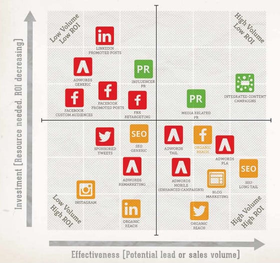
Dr. Dave Chaffey considers what digital marketing tactics businesses should adopt for 2017, with content marketing once again proving a major focus...
Read more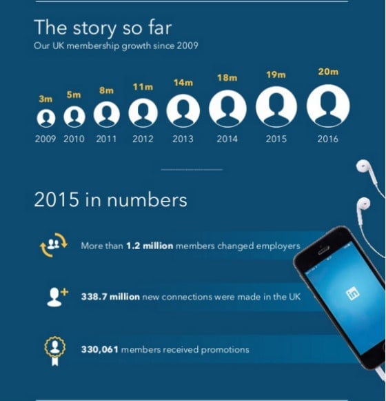
Amy Dugmore brings you all the latest updates on LinkedIn, Kenshoo, Whatsapp, Facebook, and Pinterest in this week's social media news roundup.
Read more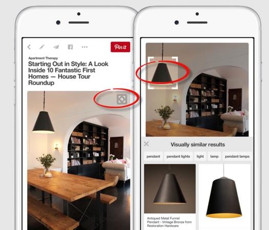
Lisa Coghlan brings you all the latest social media marketing news from the past seven days, including Instagram’s new Partner Program, Pinterest...
Read more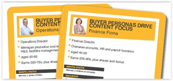
Now is the time to start planning your content marketing strategy for 2016. However, before you start populating your editorial calendar, there’s...
Read moreMake 2016 a year of great content marketing. Plan your content calendar to include these five key elements to deliver great content, build team...
Read more
Dr. Dave Chaffey explains why having a Content Marketing Plan in place is vital to success
Read moreDo you want to create an infographic but don’t know where to start? Read on as Charlotte Howell reveals her top tips and considerations for producing...
Read more